Craigslist Rebrand
For my final class project in 2022, I took on the task of rebranding Craigslist to bring it more in line with modern design fundamentals. The goal of the project was to take an in-depth look into how big companies can change and adapt to suite changing times while not alienating their existing userbase while also attracting and appealing to potential users.

The Problem
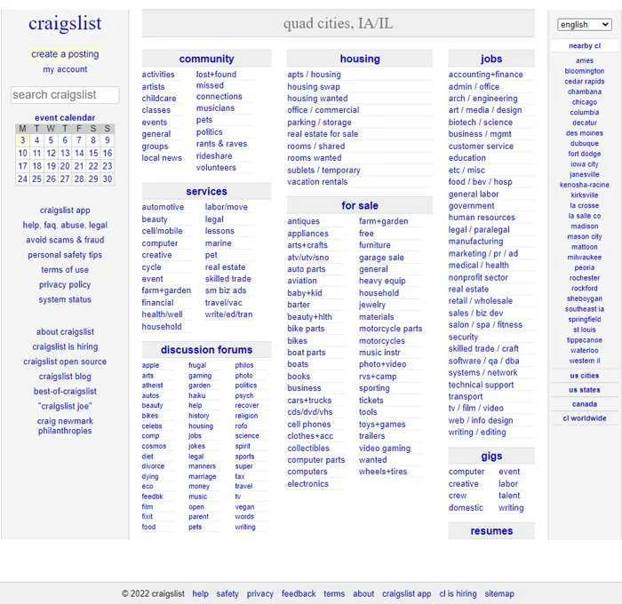
The current logo is made by simply selecting Times New Roman, changing font color to purple, and finally typing out craigslist. Not the most intuitive logo for a multi-billion dollar company.
There is a widespread initial hesitation with using craigslist as we have all grown up with the horror stories of meeting up with deceptive people through the platform, and the lack of change in the company’s branding has led that image to linger in the minds of its users.
As is evident by first opening up craigslist, the site does not meet modern design standards. All embedded text are in the original dark blue color, and as the whole main page utilizes embedded text throughout the site just ends up looking outdated and bland.
The Goal
With my project of rebranding craigslist I set out to reinvigorate the designs of old craigslist in order to change the stigma behind it. I intended to make a brand new original logo for the company, figure out a color scheme to be more appealing, and maybe some completely new additions of my own design. With the limited time I had to work on this project, I was not able to produce a website mock-up to fit the standards I had set for myself, and will not be including it in this showcase.
Logo Design
For the logo design, I spent many days sketching completely different logos and ran tests with my friends to see how impactful the designs were. By asking them to rate the logo they would inspect the sketches in detail, the following day if they could draw out the logo from memory, accurately, I would consider moving forward with the logo. This was a design that passed the test, but I felt didn’t quite suit the vision I had for the rebrand.

“Logos are the graphic extension of the internal realities of a company.”
Saul Bass
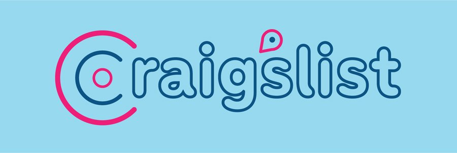
For my final logo design, I decided to add an apostrophe to pull focus on the fact that we are going through a list that is specifically catered to each user by Craig. I also designed the apostrophe to be similar to a location marker, which is purposeful as craigslist is location-based. Going along with that notion, I wanted to design the “C” to look similar to a target. There are two forms of the logo, one is collapsed with the “C” and the apostrophe, and the other is the full extended logo with the apostrophe in its correct place. I chose a friendly mix of colors to go along with the softer serif font choice.


So, with the new and improved Craig’slist one should wonder, who is Craig? Yes, I know the company is named after the creator Craig Newmark, but the everyday person needs someone to look to in his stead. A lovable, unobtrusive, and helpful friend for its millions of users to instantly recognize as its mascot.